Top 10 : The Best Stores of 2016!

TOP 10 : THE BEST STORES OF 2016!
STORES WORLD TOUR
Published on 16 Jan 2017by Célia Le Pesquer- updated on 20 Jan 2017-ACTUALITÉ
A company that raises chickens to supply eggs…Goods stored on the sales floor up to a height of 8 m... Discover the best stores of 2016!
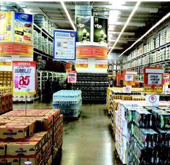
100% of Assaí stores are depots. The products are presented either on pallets or racks; less presentation work is required; goods are stored on the sales floor up to a height of 8 m.
WHERE IS ASSAÍ?
Casino, which owns Assai, has had a presence in Brazil since 1999, when the Diniz family, the owners of Pao de Açucar, needed rescuing financially. Since then, Casino has controlled the business which generated 69 billion Reals in turnover last year, a figure of around €19 billion (with 2200 stores throughout the country).
WHAT IS ASSAÍ?
With a turnover of almost €3 billion, Assai is no longer a marginal business for Casino in Brazil. However, it is also seeing strong growth: Up 30% in 2014, up 25% in 2015. In just two years, Assai has opened 20 new depots and should reach the ceiling of 100 by the end of the year. The explanation for this rapid growth: the brand's positioning, at least 15% cheaper than other hypermarkets. This is the result of a concept oriented towards controlling costs in a similar way to the US Company Costco for example.
Assai stores are actually more like depots. Averaging 4000 m2 in size and only offering between six and 7000 products allows them to increase line volumes and optimise productivity including shelf stacking, goods are often sold on pallets. What is more, at Assai (as with Atacadao by Carrefour/similar concepts), staff costs are kept to a minimum thanks to the delegation of in-store promoters by the suppliers. In this Assai for example, staff costs only amount to 4.5 %.
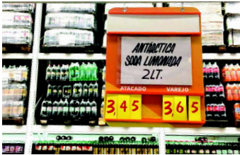
Customers offered two different prices: by the units (“Varejo” as in retail stores) and by lot (“atacado”, offered at wholesale price). The difference between these two prices is usually between 15 and 20%).
KEY FIGURES
Number of stores: 95
Sales floor: 4,000 m² on average
Number of items: 7,000
Height: 8 m
WHAT IS INTERESTING ABOUT ASSAÍ?
The depot format is currently the winning model in Brazil, and that which is seeing the strongest growth (by far)! This aims to seek benefits both on the cost side and the price side. Assai also reminds us that in the food distribution business you need to be low-cost to be low-priced. The two main drivers are still the smallest possible number of ranges (at the risk of disenfranchising customers looking for choice) and productivity on the sales floor.
This is also a winning formula from an economic viewpoint as the required investment is low. ROI is achieved more quickly by a depot than a hypermarket particularly thanks to the high margins: between 4 and 5% for Assai, which (again) demonstrates the virtues of discounts.
BIG C HANOÏ (VIETNAM)
WHERE IS BIG C?
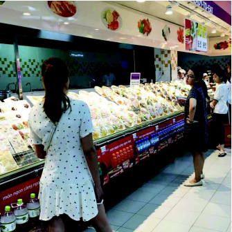
At the centre of the market area (on the hypermarket’s sales floor), the eating area always has around a hundred customers. It is surrounded by stands where you can buy hot and re-heatable products which are ready to eat. This is the beating heart of the hypermarket!
VIETNAM - Hanoï
A country with over 90 million inhabitants, Vietnam extends over a huge area. It covers a 1650 km strip of land along the edge of the China Sea. Vietnam is split commercially and economically between the North, dominated by Hanoï and its 7 million inhabitants, and Ho Chi Minh City in the south (previously Saigon, 8 million inhabitants).
WHAT IS BIG C?
French supermarkets have had a presence in Vietnam for many years.
The first hypermarket under the Cora name was opened in 1999 by the Bourbon Group, which already had a presence around the Indian Ocean. Bought out by Casino in 2005, which already owned Big C in Thailand, the chain was therefore developed under the Big C brand. At the start of 2016 the chain had 43 points of sale and a turnover of 586 million Euros.
ThangLong is the flagship of the chain in Hanoï. Opened in 2005 but completely renovated this year, it has achieved the best performance figures (by a long way). It is also the largest at almost 10,000m2. Set up in the “French style”, Big C offers a combination of food and other types of products on a single sales floor. Originality for visitors: parking There are only 300 spaces for cars but... 4,000 for motorcycles!
It is to be noted that Casino sold its Asian concerns this year. Big C Vietnam (which kept the brand) is now owned by Thaïlandais Central.
KEY FIGURES
Big C Vietnam chain:
43 points of sale
Turnover: €586 M
Big C Thang Long:
Sales floor 9,500 m2 on average
Turnover: €80 M (est.)
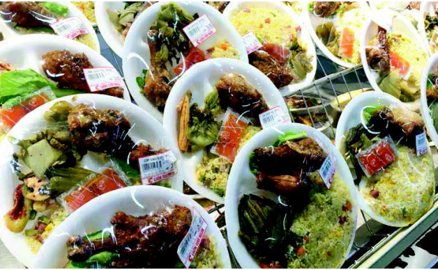
Even though the chain was owned by a French group for a very long time, the products have always been locally treated. Both in regards to the products presented e.g. frozen chicken feet or the way in which they are sold (loose rice).
WHAT IS INTERESTING ABOUT BIG C?
Big C Thang Long has come a long way from the “Distri-Ration” concept which brings together shopping and restaurants. A reconciliation of markets which was long overdue... As proof of this, a modest snacking point in a hypermarket is, de facto, a restaurant; in the same way that a restaurant offering "take-away" or home delivery is performing “traditional” distribution. Here in Hanoï, Big C has pushed restaurant integration a long way. Both in regards to setting up eateries in the center of the market area and in regards to its product policy. The hypermarket includes many stands selling ready-made products and, more originally, also offers “complete” meals which are ready to eat immediately.
CARREFOUR MILAN (ITALY)
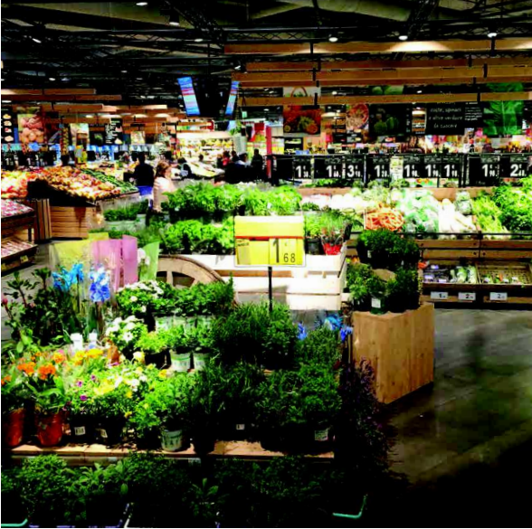
The market area is undoubtedly the "backbone" of the store. Not only in regards to its size (2,000 m2 ) but also due to its visual appearance. Its shelving units are short and only directional lighting is used.
WHERE IS CARREFOUR?
ITALY - Milan
Located in the western suburb of Milan, Carugate was the first Carrefour hypermarket in Italy, opened in 1972. For a long time it was a large format hypermarket covering an area of 16,000 m2, before being reduced in size last year. It was far bigger than most of the Carrefour in Italy: it achieved €85 million in turnover.
WHAT IS CARREFOUR?
Carrefour decided to dedicate one hypermarket to R&D in each of its major countries (France, Belgium, Italy, Spain). The purpose was to create an "in situ laboratory" to help design the hypermarkets of the future. This was the case with Monsen in Belgium, Villiers-en-Bière in France, Madrid in Spain and Milan- Carugate in Italy.
In Italy, Carrefour particularly placed the emphasis on the market area (traditional fresh produce). Each segment was treated like a specialised counter, with on-site fabrication visible to the public. This is true for the bread and cake-making laboratory, which is still at the center of the store and not hidden away by the stock rooms. The shelving displays are short to create islands around which customers can circulate, and the selection of premium products improve the ambiance of the zones. For example, this is the case with the butchers counter with its maturing room, and the fruit and vegetable section with its self-service counter. In short, a hypermarket which is above all… a market!
KEY FIGURES
Sales floor: 12,000 m2
Turnover: €85 M (est.)
Market floor space: 2,000 m2
Number of spots: > 2,000 LEDs
WHAT IS INTERESTING ABOUT CARREFOUR?
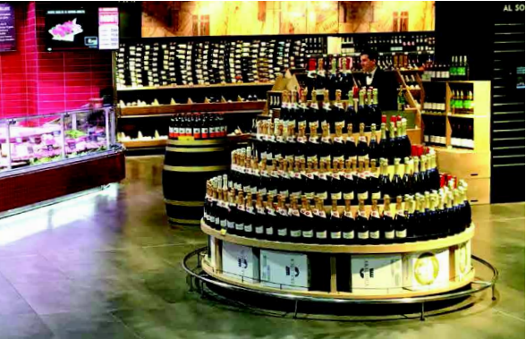
Other merchandising strategies included the creation of an organic section and creating a wine display near the butcher's counter. In visual terms, the wine section almost forms part of the market area.
In Carugare, Carrefour took a gamble: maintaining an attractive food offering while reducing its size by 4,000 m2 (from 16 to 12,000 m2). Success! The fresh food area is probably the best ever achieved by Carrefour. The hypermarket offers 2,000 m2 of market space, far more than Carrefour Planet (in 2010), which was the goal in the first place. As the store’s display window, the zone is located parallel to the checkout desks, making it clearly visible from the gallery.
Carrefour also added a few merchandising tricks. For example, it used the tableware section as the boundary between the food and non-food sections (logical) and moved the wine section closer to the market area.
CRU WIJNEGEM (BELGIUM)
WHERE IS CRU?
The very first Cru opened in an old farm in Overijse, about 20 km south of Brussels. The second was located at an equally original site on the banks of a canal in an abandoned distillery, the grain silos of which had been converted to high-end apartments. The company's strategy was therefore to cultivate a radically differentiated position…
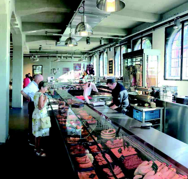
Traditional fresh products are the mainstay of the store. The ambience is intentionally sober to focus the customer's attention on the products. Products which Cru sees as being exceptional. For example, major consumer brands are entirely absent.
WHAT IS CRU?
Unlike Colruyt, the Belgian discount champions, Cru has decided to occupy a high-end position. For Cru, the essential factor is the intrinsic quality of its products and not their presentation. They therefore have a premium offering and the price is secondary. For example, ripe mangoes and blackberries with guaranteed sugar levels are sold at close to€10 per kilo. In the deli section, ready-cooked beans are sold at €22.5 per kilo, which is surprising. In this sense, Cru is looking to draw comparisons with restaurants. Another example: the butcher's counter displays a large range of matured meats sold at €58 per kilo. As such, the usual brands are not found on the shelves, not even in the grocery section where, again, Cru follows after Fauchon rather than Colruyt. Another interesting factor in this concept is the limited choice. Fewer than 800 items on 500 m² of floor space. The fish section only has 10 types of fish for example. But these are the 10 best products available that day.
KEY FIGURES
Sales floor: 500 m²
Number of items: 800
Number of employees: 35
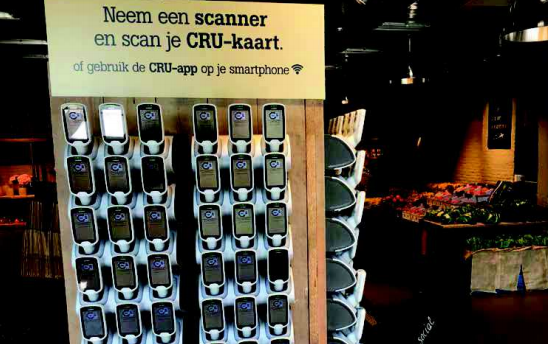
From the very first store it opened, Colruyt made the radical decision to get rid of checkout. When entering the store, customers have no other choice than to take a self-scanning gun to record their purchases.
WHAT IS INTERESTING ABOUT CRU?
For anyone who has seen the austerity of Colruyt, founded as a low-cost operator, a visit to Cru will come as a surprise. The Belgian group has reversed its priorities: cost-cutting at Colruyt supermarket; product quality at Cru. And even if the company is forced to compromise on some items, it never affects quality.
The customer experience is also excellent. The sobriety of the furniture and the industrial ambiance focuses the customer's attention on the products. In this context, the decision to require customers to scan items themselves is an additional surprise.
DAY BY DAY NANTES (FRANCE)
WHERE IS DAY BY DAY?
The company's first store opened in 2013 in Meudon (92). Nantes, the fifth store, opened only two years later, the time taken to prove the concept. Stores are always located in town centers close to other food outlets (butchers, bakers, off-licences etc.). By mid-2016, Day by Day had 16 outlets. And around a dozen additional stores will open before the end of the year.
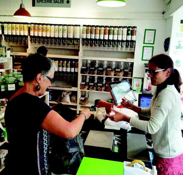
Day by Day is a small-format grocery store (around 50 m2 ) designed to be operated by independent merchants (the chain is a franchise).
WHAT IS DAY BY DAY?
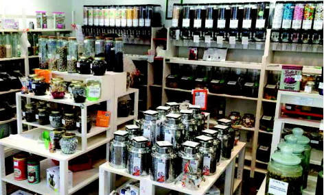
Day by Day describes itself as being a “self-service grocers". The average size of stores is 50 m2 (up to 70 m2 wherever possible), and Day by Day sells around 500 items by weight. Whether it be pasta, cereal, flour, olive oil,even washing up liquid and soap, the customer always chooses the amount they want to buy. Some frequent customers also bring their own Containers. For the others, Day by Day provides bags and will even supply jars. Some of these jars have even been donated by the customers themselves. The goal here is clearly to look for different ways of consuming products. In short, it is a form of militantism which is similar in some ways to organic shops. What is more, a significant portion of the offering is supplied by organic farms. However, this was not the original goal of the chain. Explanation: for some products, only organic suppliers will sell by weight. For reasons of hygiene and operating practices in stores, it should be noted that fresh products are absent. Although Day by Day is thinking about this as well…
KEY FIGURES
Number of stores: 25 (by the end of 2016)
Sales floor: on average between 50 and 70 m2
Number of items: 500
Target: 100 stores (by the end of 2018)
Other innovations include an extension to the fresh produce zone with the inclusion of a private label restaurant. Terre d’Italia is in fact the local equivalent of Reflets de France.
WHAT IS INTERESTING ABOUT DAY BY DAY?
Financially speaking, Day by Day is a modest initiative. Even if they meet the goal of establishing 100 stores by the end of 2018, the company is not showing on the radar of supermarket chains as it has a turnover under €30 million (the equivalent of a very small hypermarket!). However, Day by Day illustrates the current appetite for "alternative consumption methods" and says a lot about changing consumer trends. What is more, a number of "traditional" outlets are now also offering loose products. Auchan pioneered this around 10 years ago. Lidl is also currently testing the system in around 50 stores. Day by Day is therefore riding a structural change in consumer trends!
FORAGERS NEW-YORK (USA)
WHERE IS FORAGERS?
Due to its population (9 million inhabitants), living standards and cultural diversity, New York is a vibrant retail destination. A number of commercial initiatives have been taken in Manhattan and Brooklyn, New York's new gentrified district. This is precisely the case for Foragers, which opened its first store in Brooklyn in 2005 and a second in Manhattan in 2012. In the meantime, Foragers opened its own farm in Colombia in 2009.
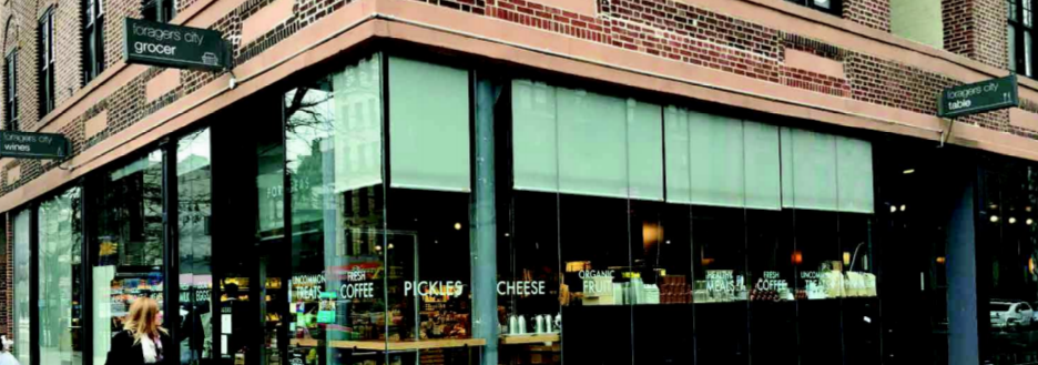
The ambience in stores cultivates the elitist dimension of the concept: furniture is mostly made from wood, products are presented “raw" to emphasise their natural origins (e.g. the leaves are always left on carrots), dark ceilings and directional lighting to focus the customer's attention on the products etc.
WHAT IS FORAGERS?
Foragers combines several clearly identified trends in a single concept to create the store of tomorrow: local suppliers, natural products and distribution (contracting of distribution and restaurants). Using very local suppliers, Foragers caters to “locavores”, customers for which the distance traveled by a product is a determining factor. To demonstrate its commitment, Foragers has also purchased farming land just an hour away from Manhattan. The company uses it to grow the vegetables it sells and raises chickens to supply eggs. For its other products, Foragers guarantees its sources down to the farm, taking a similar position to Whole Foods (hormone-free, antibiotic-free etc.), the US leader in organic and natural food stuffs. Lastly, Foragers also offers “raw" products as well as takeaway and ready-to-eat products prepared in the store by a real chef.
KEY FIGURES
Store opening: 2012
Sales floor: 340 m2
Investment: $1 M
Turnover: $10 M
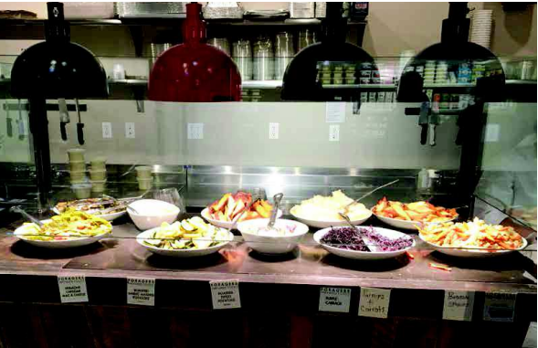
This is the second foundation of the concept: the sale of ready-to-eat products. Cold products on one side (salad bar), and hot dishes on the other, prepared on site each day by a real chef.
WHAT IS INTERESTING ABOUT FORAGERS?
Foragers is representative of the creative streak in American food retailing. Running counter to the strategies which prevailed during the 90s and 00s, the size of the sales floor is not the determining factor. The essential factor is the positioning of the brand, its mission and its convictions. In this regard, the way in which Foragers puts it into practice is still to be seen, whether we are talking about out-of-store or in-store communications. Lastly, given its individual vision of foodstuffs overall, Foragers takes a comprehensive approach: it is both a mini-supermarket for takeaway products, and a restaurant (55 covers, 120 m2 ) for on-site consumption. Both use the same types of products: local, natural etc.
IPER LA GRANDE ARESE (ITALY)
WHERE IS IPER LA GRANDE?
Italy
At 120,000 m2 , the Arese Shopping Center, between Milan and Malpensa airport lays claim to the title of the largest shopping center in Italy. It is certainly the most recent (opened in 2016), the most modern in terms of its shopping experience and also the most original, due to its roots. The shopping center was constructed on the site of the old Alfa Romeo factory, and there is still a museum there dedicated to this manufacturer. In other words, the location is well known by the Milanese!
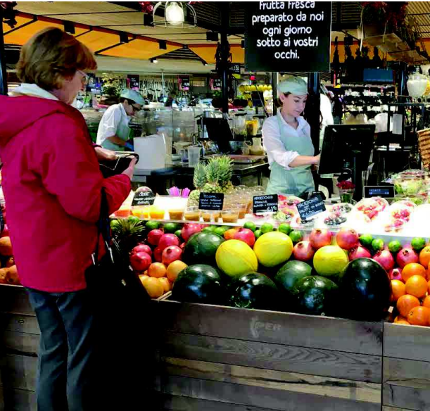
Iper La Grande clearly breaks the traditional rules applying to hypermarkets. Firstly through a multitude of serviced counters; the ability to consume ready-made meals on site which are prepared in a central kitchen on the sales floor; and lastly, and more generally, the "market" atmosphere which almost lets you forget that you are in a hypermarket!
WHAT IS IPER LA GRANDE?
Iper La Grande belongs to the Italian group Finiper, which has long been a partner of the French group, Promodès (and therefore Carrefour, which owns 20 % of it). However, Finiper and Carrefour are now direct competitors, particularly in the north of Italy. Finiper operates 27 hypermarkets under the Iper La Grande brand name, as well as a chain of supermarkets called Unes. It has a total turnover of just under €3 billion. With a sales floor of around 9000 m2 , Arese is far bigger than the average supermarket. However, the Iper hypermarkets have retained their dominance in food products (by a wide margin) in the the concept is similar to that of large supermarkets Non-food products occupy less than 15 % of the sales floor (compared to 30/35 % in a traditional hypermarkets). But, above all, it is product selection, theatre and on-site preparation which radically differentiate Iper from its competitors.
KEY FIGURES
Sales floor: 9,000 m²
Self-service stands: 10
Home-roasted coffees: 30
Central kitchen: around 150 m2 (in the store)
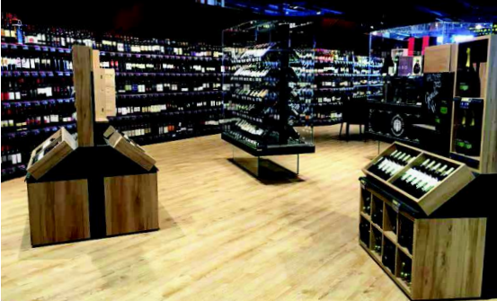
The wine section is a good representation of the global strategy. The products are presented with more care than usual and customers can even sit down to drink a glass of wine with anti-pasti in the hypermarket itself.
WHAT IS INTERESTING ABOUT IPER LA GRANDE?
If the French invented the hypermarket concept (Carrefour in 1963), the Italian company Finiper is in the process of reinventing it… In this regard, Iper returns the nobility to food in the context of a hypermarket. Its size enables it to be extravagant. It breaks away from the traditional "herringbone" layout with a series of long perpendicular shelving units. This also allows it to develop new ideas regarding furniture (and to break away from the visual routine of a conventional hypermarket). The store is not just a point of sale, it is also a point of consumption thanks to the kitchen area installed at its center. The menu is by no means limited to sandwiches and burgers… Iper Arese is a true "temple of food"!
LECLERC BIO & ITALIEN NICE (FRANCE)
WHERE IS LECLERC BIO & ITALIEN?
Under the Nice stadium, in a shopping center which is still being commercialized (Nice One), which Leclerc opened in June 2016 with a resolutely breakthrough concept for the brand, mixing organic and Italian products (see below). Two differentiating factors in Nice: firstly, its proximity to Italy and the Italian culture which has always influenced life in Nice; and higher living standards than the average
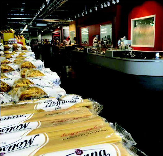
The Italian section is the largest part of the store and covers 2,000 m2 out of the 3,300 available. Highlights, pasta products (30 different makes of dry pasta and 40 varieties of fresh pasta) and the sliced cured meats counter. Store has recruited real French-speaking Italians to oversee the service. Great atmosphere!
WHAT IS LECLERC BIO & ITALIEN?
The originality of the location and the dual offering. Only organic products and Italian products are sold here. And, in a very large store! Virtually none of the products included in the offering can be found in traditional supermarkets. In the organic section for example, Leclerc is supplied by suppliers which normally cater to specialised circuits (Biocoop, Naturalia, etc.). Our Italian products are delivered directly by trans-Alpine suppliers. Additional originality: not all sections are represented. In the Italian section for example, you can find groceries, fruits and vegetables, cheese counters and cured meat counters, but there is no fish counter or butchers. Lastly, Leclerc Organic and Italian also sells food to take away and to eat in, with enough restaurant space for 80 customers. It should also be noted that the logo on the storefront and in media does not explicitly include the word “Leclerc”. Just the logo… Explanation: so as not to scare away suppliers!
KEY FIGURES
Sales floor: 3,300 m²
Italian section…: 2,000 m2 & 2,500 items
Organic section…: 1,300 m2 & 9,000 items
Provisional Turnover: €15 million
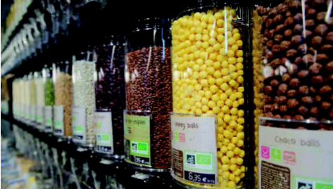
Leclerc traditionally sells 150 loose products from baskets containing pulses, cereals, biscuits, coffee, tea, etc. Increasingly original, a naturopath is always available on the sales floor.
WHAT IS INTERESTING ABOUT LECLERC BIO & ITALIEN?
While this is a bold concept, it is also well executed, above all for a project which bears the logo of a supermarket chain! The floor is made from smooth concrete, the shelves are made from glass and a number of products are presented on low tables as in department stores etc. In short, the buying experience is radically different from that found in a "traditional” Leclerc store. As with Cru in Belgium (also highlighted in this World Tour), Leclerc Bio et Italien provides a very sophisticated food offering both in regards to the customers themselves and their purchases, and is looking to move away from "ordinary shopping experiences".
LIDL MONTAUBAN (FRANCE)
WHERE IS LIDL?
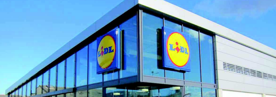
Lidl has been unceasingly modifying its design concept over the last three or four years (often by enriching it). We have seen the arrival of baked goods shelves, new check-out desks, new frontages etc. At Montauban, Lidl has implemented all its new initiatives and has created a pilot store. The Montauban store has been the model for the Lidl store of the future for at least the last two or three years. It is the one which has inspired all the latest renovations and future developments.
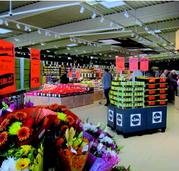
It has made radical changes to its entrances. The zones are now more open offering a wider view, and the flower selection (on sale!) welcomes customers to the store. The first display (baked goods) is intended to create the sense that it is an everyday shopping destination to attract customers on a daily basis. Lidl also bakes bread and cakes throughout the day to ensure the display is always well-stocked.
KEY FIGURES
Sales floor: 1,420 m²
Turnover: €18 million (est.)
Number of items: 1,600
WHAT IS INTERESTING ABOUT LIDL?
We need to keep the vintage Lidls of 2005 to 2010 in mind to properly evaluate the progress made at Montauban! While previously only price mattered (and all initiatives were judged in these terms), the priority is now the customer. And nothing is too good for the customer. Choice, lighting, selection, shopping experience etc, the “Montauban Lidl” model home has changed almost everything. This is clearly visible from the entry airlock (the first) and the presence of a coffee machine. Only the appetizers are missing!
In the interior, Lidl has created a more pleasing ambiance using two main colors: light wood for some of the furniture, and anthracite grey for others, and the walls in particular.
MARKTHAL ROTTERDAM (NETHERLANDS)
WHERE IS MARKTHAL?
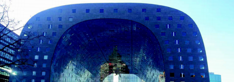
Markthal could not be better situated: in the very center of Rotterdam in the historic neighborhood of Binnenrotte, and a stone's throw from Station Blaak. Access to Markthal is so easy that it has become both a shopping destination for local inhabitants and a tourist destination for visitors. Markthal is not only a major food market, it is also a major architectural landmark which is easily recognizable from a distance!
WHAT IS MARKTHAL?
A destination which is truly unique in its category… From the exterior, the building is indeed recognisable from afar in that it is constructed in the form of a hollow cylinder with end-to-end natural light. Over 200 high-end apartments have been constructed in the walls with views on each side: inwards onto the forum and outwards onto the city.
The glass and steel center of the cylinder is occupied by a vast hall of 6,200 m2 and a height of 40 meters at the top of the arch, decorated in the style of a cornucopia. This hall is entirely dedicated to the sale of foodstuff's, in the image of a traditional market. It includes around 80 stalls selling all types of goods: fruits and vegetables, fish, cured meats and meat, for example. Restaurants are dotted around between the stalls, reinforcing the culinary aspect of the site.
Another type of shopping experience is available in the basement. Ahold, the leading Dutch retailer, has constructed an Albert Heijn supermarket there the surface area of 1,500 m2.
KEY FIGURES
Floor footprint: 120 x 90 m
Height of the arch: 40 m
Construction: 4 years
Sales floor: 6,200 m2
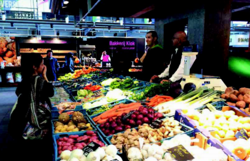
On its ground floor, 96 permanent stalls mostly sell fresh produce: cheese, meat, fruits and vegetables, baked goods etc.
WHAT IS INTERESTING ABOUT MARKTHAL?
At first glance, Markthal looks like a reinterpretation of the traditional covered market. But its scope is far more ambitious. Firstly because it combines food shopping with takeaway restaurants and seated restaurants. Secondly because Markthal is a living space above all, with 228 apartments constructed in the walls of the hall. Last, but by no means least, it is an extremely spectacular building. To the point that it has won a number of awards including the Mipim Award (a trade show).


TOP 10 : THE BEST STORES OF 2016!
STORES WORLD TOUR
Published on 16 Jan 2017by Célia Le Pesquer- updated on 20 Jan 2017-ACTUALITÉ
A company that raises chickens to supply eggs…Goods stored on the sales floor up to a height of 8 m... Discover the best stores of 2016!
ASSAÍ SAO PAULO (BRAZIL)

100% of Assaí stores are depots. The products are presented either on pallets or racks; less presentation work is required; goods are stored on the sales floor up to a height of 8 m.
WHERE IS ASSAÍ?
Casino, which owns Assai, has had a presence in Brazil since 1999, when the Diniz family, the owners of Pao de Açucar, needed rescuing financially. Since then, Casino has controlled the business which generated 69 billion Reals in turnover last year, a figure of around €19 billion (with 2200 stores throughout the country).
WHAT IS ASSAÍ?
With a turnover of almost €3 billion, Assai is no longer a marginal business for Casino in Brazil. However, it is also seeing strong growth: Up 30% in 2014, up 25% in 2015. In just two years, Assai has opened 20 new depots and should reach the ceiling of 100 by the end of the year. The explanation for this rapid growth: the brand's positioning, at least 15% cheaper than other hypermarkets. This is the result of a concept oriented towards controlling costs in a similar way to the US Company Costco for example.
Assai stores are actually more like depots. Averaging 4000 m2 in size and only offering between six and 7000 products allows them to increase line volumes and optimise productivity including shelf stacking, goods are often sold on pallets. What is more, at Assai (as with Atacadao by Carrefour/similar concepts), staff costs are kept to a minimum thanks to the delegation of in-store promoters by the suppliers. In this Assai for example, staff costs only amount to 4.5 %.

Customers offered two different prices: by the units (“Varejo” as in retail stores) and by lot (“atacado”, offered at wholesale price). The difference between these two prices is usually between 15 and 20%).
KEY FIGURES
Number of stores: 95
Sales floor: 4,000 m² on average
Number of items: 7,000
Height: 8 m
WHAT IS INTERESTING ABOUT ASSAÍ?
The depot format is currently the winning model in Brazil, and that which is seeing the strongest growth (by far)! This aims to seek benefits both on the cost side and the price side. Assai also reminds us that in the food distribution business you need to be low-cost to be low-priced. The two main drivers are still the smallest possible number of ranges (at the risk of disenfranchising customers looking for choice) and productivity on the sales floor.
This is also a winning formula from an economic viewpoint as the required investment is low. ROI is achieved more quickly by a depot than a hypermarket particularly thanks to the high margins: between 4 and 5% for Assai, which (again) demonstrates the virtues of discounts.
BIG C HANOÏ (VIETNAM)
WHERE IS BIG C?

At the centre of the market area (on the hypermarket’s sales floor), the eating area always has around a hundred customers. It is surrounded by stands where you can buy hot and re-heatable products which are ready to eat. This is the beating heart of the hypermarket!
VIETNAM - Hanoï
A country with over 90 million inhabitants, Vietnam extends over a huge area. It covers a 1650 km strip of land along the edge of the China Sea. Vietnam is split commercially and economically between the North, dominated by Hanoï and its 7 million inhabitants, and Ho Chi Minh City in the south (previously Saigon, 8 million inhabitants).
WHAT IS BIG C?
French supermarkets have had a presence in Vietnam for many years.
The first hypermarket under the Cora name was opened in 1999 by the Bourbon Group, which already had a presence around the Indian Ocean. Bought out by Casino in 2005, which already owned Big C in Thailand, the chain was therefore developed under the Big C brand. At the start of 2016 the chain had 43 points of sale and a turnover of 586 million Euros.
ThangLong is the flagship of the chain in Hanoï. Opened in 2005 but completely renovated this year, it has achieved the best performance figures (by a long way). It is also the largest at almost 10,000m2. Set up in the “French style”, Big C offers a combination of food and other types of products on a single sales floor. Originality for visitors: parking There are only 300 spaces for cars but... 4,000 for motorcycles!
It is to be noted that Casino sold its Asian concerns this year. Big C Vietnam (which kept the brand) is now owned by Thaïlandais Central.
KEY FIGURES
Big C Vietnam chain:
43 points of sale
Turnover: €586 M
Big C Thang Long:
Sales floor 9,500 m2 on average
Turnover: €80 M (est.)

Even though the chain was owned by a French group for a very long time, the products have always been locally treated. Both in regards to the products presented e.g. frozen chicken feet or the way in which they are sold (loose rice).
WHAT IS INTERESTING ABOUT BIG C?
Big C Thang Long has come a long way from the “Distri-Ration” concept which brings together shopping and restaurants. A reconciliation of markets which was long overdue... As proof of this, a modest snacking point in a hypermarket is, de facto, a restaurant; in the same way that a restaurant offering "take-away" or home delivery is performing “traditional” distribution. Here in Hanoï, Big C has pushed restaurant integration a long way. Both in regards to setting up eateries in the center of the market area and in regards to its product policy. The hypermarket includes many stands selling ready-made products and, more originally, also offers “complete” meals which are ready to eat immediately.
CARREFOUR MILAN (ITALY)

The market area is undoubtedly the "backbone" of the store. Not only in regards to its size (2,000 m2 ) but also due to its visual appearance. Its shelving units are short and only directional lighting is used.
WHERE IS CARREFOUR?
ITALY - Milan
Located in the western suburb of Milan, Carugate was the first Carrefour hypermarket in Italy, opened in 1972. For a long time it was a large format hypermarket covering an area of 16,000 m2, before being reduced in size last year. It was far bigger than most of the Carrefour in Italy: it achieved €85 million in turnover.
WHAT IS CARREFOUR?
Carrefour decided to dedicate one hypermarket to R&D in each of its major countries (France, Belgium, Italy, Spain). The purpose was to create an "in situ laboratory" to help design the hypermarkets of the future. This was the case with Monsen in Belgium, Villiers-en-Bière in France, Madrid in Spain and Milan- Carugate in Italy.
In Italy, Carrefour particularly placed the emphasis on the market area (traditional fresh produce). Each segment was treated like a specialised counter, with on-site fabrication visible to the public. This is true for the bread and cake-making laboratory, which is still at the center of the store and not hidden away by the stock rooms. The shelving displays are short to create islands around which customers can circulate, and the selection of premium products improve the ambiance of the zones. For example, this is the case with the butchers counter with its maturing room, and the fruit and vegetable section with its self-service counter. In short, a hypermarket which is above all… a market!
KEY FIGURES
Sales floor: 12,000 m2
Turnover: €85 M (est.)
Market floor space: 2,000 m2
Number of spots: > 2,000 LEDs
WHAT IS INTERESTING ABOUT CARREFOUR?

Other merchandising strategies included the creation of an organic section and creating a wine display near the butcher's counter. In visual terms, the wine section almost forms part of the market area.
In Carugare, Carrefour took a gamble: maintaining an attractive food offering while reducing its size by 4,000 m2 (from 16 to 12,000 m2). Success! The fresh food area is probably the best ever achieved by Carrefour. The hypermarket offers 2,000 m2 of market space, far more than Carrefour Planet (in 2010), which was the goal in the first place. As the store’s display window, the zone is located parallel to the checkout desks, making it clearly visible from the gallery.
Carrefour also added a few merchandising tricks. For example, it used the tableware section as the boundary between the food and non-food sections (logical) and moved the wine section closer to the market area.
CRU WIJNEGEM (BELGIUM)
WHERE IS CRU?
The very first Cru opened in an old farm in Overijse, about 20 km south of Brussels. The second was located at an equally original site on the banks of a canal in an abandoned distillery, the grain silos of which had been converted to high-end apartments. The company's strategy was therefore to cultivate a radically differentiated position…

Traditional fresh products are the mainstay of the store. The ambience is intentionally sober to focus the customer's attention on the products. Products which Cru sees as being exceptional. For example, major consumer brands are entirely absent.
WHAT IS CRU?
Unlike Colruyt, the Belgian discount champions, Cru has decided to occupy a high-end position. For Cru, the essential factor is the intrinsic quality of its products and not their presentation. They therefore have a premium offering and the price is secondary. For example, ripe mangoes and blackberries with guaranteed sugar levels are sold at close to€10 per kilo. In the deli section, ready-cooked beans are sold at €22.5 per kilo, which is surprising. In this sense, Cru is looking to draw comparisons with restaurants. Another example: the butcher's counter displays a large range of matured meats sold at €58 per kilo. As such, the usual brands are not found on the shelves, not even in the grocery section where, again, Cru follows after Fauchon rather than Colruyt. Another interesting factor in this concept is the limited choice. Fewer than 800 items on 500 m² of floor space. The fish section only has 10 types of fish for example. But these are the 10 best products available that day.
KEY FIGURES
Sales floor: 500 m²
Number of items: 800
Number of employees: 35

From the very first store it opened, Colruyt made the radical decision to get rid of checkout. When entering the store, customers have no other choice than to take a self-scanning gun to record their purchases.
WHAT IS INTERESTING ABOUT CRU?
For anyone who has seen the austerity of Colruyt, founded as a low-cost operator, a visit to Cru will come as a surprise. The Belgian group has reversed its priorities: cost-cutting at Colruyt supermarket; product quality at Cru. And even if the company is forced to compromise on some items, it never affects quality.
The customer experience is also excellent. The sobriety of the furniture and the industrial ambiance focuses the customer's attention on the products. In this context, the decision to require customers to scan items themselves is an additional surprise.
DAY BY DAY NANTES (FRANCE)
WHERE IS DAY BY DAY?
The company's first store opened in 2013 in Meudon (92). Nantes, the fifth store, opened only two years later, the time taken to prove the concept. Stores are always located in town centers close to other food outlets (butchers, bakers, off-licences etc.). By mid-2016, Day by Day had 16 outlets. And around a dozen additional stores will open before the end of the year.

Day by Day is a small-format grocery store (around 50 m2 ) designed to be operated by independent merchants (the chain is a franchise).
WHAT IS DAY BY DAY?
Day by Day describes itself as being a “self-service grocers". The average size of stores is 50 m2 (up to 70 m2 wherever possible), and Day by Day sells around 500 items by weight. Whether it be pasta, cereal, flour, olive oil,even washing up liquid and soap, the customer always chooses the amount they want to buy. Some frequent customers also bring their own Containers. For the others, Day by Day provides bags and will even supply jars. Some of these jars have even been donated by the customers themselves. The goal here is clearly to look for different ways of consuming products. In short, it is a form of militantism which is similar in some ways to organic shops. What is more, a significant portion of the offering is supplied by organic farms. However, this was not the original goal of the chain. Explanation: for some products, only organic suppliers will sell by weight. For reasons of hygiene and operating practices in stores, it should be noted that fresh products are absent. Although Day by Day is thinking about this as well…
KEY FIGURES
Number of stores: 25 (by the end of 2016)
Sales floor: on average between 50 and 70 m2
Number of items: 500
Target: 100 stores (by the end of 2018)

Other innovations include an extension to the fresh produce zone with the inclusion of a private label restaurant. Terre d’Italia is in fact the local equivalent of Reflets de France.
WHAT IS INTERESTING ABOUT DAY BY DAY?
Financially speaking, Day by Day is a modest initiative. Even if they meet the goal of establishing 100 stores by the end of 2018, the company is not showing on the radar of supermarket chains as it has a turnover under €30 million (the equivalent of a very small hypermarket!). However, Day by Day illustrates the current appetite for "alternative consumption methods" and says a lot about changing consumer trends. What is more, a number of "traditional" outlets are now also offering loose products. Auchan pioneered this around 10 years ago. Lidl is also currently testing the system in around 50 stores. Day by Day is therefore riding a structural change in consumer trends!
FORAGERS NEW-YORK (USA)
WHERE IS FORAGERS?
Due to its population (9 million inhabitants), living standards and cultural diversity, New York is a vibrant retail destination. A number of commercial initiatives have been taken in Manhattan and Brooklyn, New York's new gentrified district. This is precisely the case for Foragers, which opened its first store in Brooklyn in 2005 and a second in Manhattan in 2012. In the meantime, Foragers opened its own farm in Colombia in 2009.

The ambience in stores cultivates the elitist dimension of the concept: furniture is mostly made from wood, products are presented “raw" to emphasise their natural origins (e.g. the leaves are always left on carrots), dark ceilings and directional lighting to focus the customer's attention on the products etc.
WHAT IS FORAGERS?
Foragers combines several clearly identified trends in a single concept to create the store of tomorrow: local suppliers, natural products and distribution (contracting of distribution and restaurants). Using very local suppliers, Foragers caters to “locavores”, customers for which the distance traveled by a product is a determining factor. To demonstrate its commitment, Foragers has also purchased farming land just an hour away from Manhattan. The company uses it to grow the vegetables it sells and raises chickens to supply eggs. For its other products, Foragers guarantees its sources down to the farm, taking a similar position to Whole Foods (hormone-free, antibiotic-free etc.), the US leader in organic and natural food stuffs. Lastly, Foragers also offers “raw" products as well as takeaway and ready-to-eat products prepared in the store by a real chef.
KEY FIGURES
Store opening: 2012
Sales floor: 340 m2
Investment: $1 M
Turnover: $10 M

This is the second foundation of the concept: the sale of ready-to-eat products. Cold products on one side (salad bar), and hot dishes on the other, prepared on site each day by a real chef.
WHAT IS INTERESTING ABOUT FORAGERS?
Foragers is representative of the creative streak in American food retailing. Running counter to the strategies which prevailed during the 90s and 00s, the size of the sales floor is not the determining factor. The essential factor is the positioning of the brand, its mission and its convictions. In this regard, the way in which Foragers puts it into practice is still to be seen, whether we are talking about out-of-store or in-store communications. Lastly, given its individual vision of foodstuffs overall, Foragers takes a comprehensive approach: it is both a mini-supermarket for takeaway products, and a restaurant (55 covers, 120 m2 ) for on-site consumption. Both use the same types of products: local, natural etc.
IPER LA GRANDE ARESE (ITALY)
WHERE IS IPER LA GRANDE?
Italy
At 120,000 m2 , the Arese Shopping Center, between Milan and Malpensa airport lays claim to the title of the largest shopping center in Italy. It is certainly the most recent (opened in 2016), the most modern in terms of its shopping experience and also the most original, due to its roots. The shopping center was constructed on the site of the old Alfa Romeo factory, and there is still a museum there dedicated to this manufacturer. In other words, the location is well known by the Milanese!

Iper La Grande clearly breaks the traditional rules applying to hypermarkets. Firstly through a multitude of serviced counters; the ability to consume ready-made meals on site which are prepared in a central kitchen on the sales floor; and lastly, and more generally, the "market" atmosphere which almost lets you forget that you are in a hypermarket!
WHAT IS IPER LA GRANDE?
Iper La Grande belongs to the Italian group Finiper, which has long been a partner of the French group, Promodès (and therefore Carrefour, which owns 20 % of it). However, Finiper and Carrefour are now direct competitors, particularly in the north of Italy. Finiper operates 27 hypermarkets under the Iper La Grande brand name, as well as a chain of supermarkets called Unes. It has a total turnover of just under €3 billion. With a sales floor of around 9000 m2 , Arese is far bigger than the average supermarket. However, the Iper hypermarkets have retained their dominance in food products (by a wide margin) in the the concept is similar to that of large supermarkets Non-food products occupy less than 15 % of the sales floor (compared to 30/35 % in a traditional hypermarkets). But, above all, it is product selection, theatre and on-site preparation which radically differentiate Iper from its competitors.
KEY FIGURES
Sales floor: 9,000 m²
Self-service stands: 10
Home-roasted coffees: 30
Central kitchen: around 150 m2 (in the store)

The wine section is a good representation of the global strategy. The products are presented with more care than usual and customers can even sit down to drink a glass of wine with anti-pasti in the hypermarket itself.
WHAT IS INTERESTING ABOUT IPER LA GRANDE?
If the French invented the hypermarket concept (Carrefour in 1963), the Italian company Finiper is in the process of reinventing it… In this regard, Iper returns the nobility to food in the context of a hypermarket. Its size enables it to be extravagant. It breaks away from the traditional "herringbone" layout with a series of long perpendicular shelving units. This also allows it to develop new ideas regarding furniture (and to break away from the visual routine of a conventional hypermarket). The store is not just a point of sale, it is also a point of consumption thanks to the kitchen area installed at its center. The menu is by no means limited to sandwiches and burgers… Iper Arese is a true "temple of food"!
LECLERC BIO & ITALIEN NICE (FRANCE)
WHERE IS LECLERC BIO & ITALIEN?
Under the Nice stadium, in a shopping center which is still being commercialized (Nice One), which Leclerc opened in June 2016 with a resolutely breakthrough concept for the brand, mixing organic and Italian products (see below). Two differentiating factors in Nice: firstly, its proximity to Italy and the Italian culture which has always influenced life in Nice; and higher living standards than the average
in France.

The Italian section is the largest part of the store and covers 2,000 m2 out of the 3,300 available. Highlights, pasta products (30 different makes of dry pasta and 40 varieties of fresh pasta) and the sliced cured meats counter. Store has recruited real French-speaking Italians to oversee the service. Great atmosphere!
WHAT IS LECLERC BIO & ITALIEN?
The originality of the location and the dual offering. Only organic products and Italian products are sold here. And, in a very large store! Virtually none of the products included in the offering can be found in traditional supermarkets. In the organic section for example, Leclerc is supplied by suppliers which normally cater to specialised circuits (Biocoop, Naturalia, etc.). Our Italian products are delivered directly by trans-Alpine suppliers. Additional originality: not all sections are represented. In the Italian section for example, you can find groceries, fruits and vegetables, cheese counters and cured meat counters, but there is no fish counter or butchers. Lastly, Leclerc Organic and Italian also sells food to take away and to eat in, with enough restaurant space for 80 customers. It should also be noted that the logo on the storefront and in media does not explicitly include the word “Leclerc”. Just the logo… Explanation: so as not to scare away suppliers!
KEY FIGURES
Sales floor: 3,300 m²
Italian section…: 2,000 m2 & 2,500 items
Organic section…: 1,300 m2 & 9,000 items
Provisional Turnover: €15 million

Leclerc traditionally sells 150 loose products from baskets containing pulses, cereals, biscuits, coffee, tea, etc. Increasingly original, a naturopath is always available on the sales floor.
WHAT IS INTERESTING ABOUT LECLERC BIO & ITALIEN?
While this is a bold concept, it is also well executed, above all for a project which bears the logo of a supermarket chain! The floor is made from smooth concrete, the shelves are made from glass and a number of products are presented on low tables as in department stores etc. In short, the buying experience is radically different from that found in a "traditional” Leclerc store. As with Cru in Belgium (also highlighted in this World Tour), Leclerc Bio et Italien provides a very sophisticated food offering both in regards to the customers themselves and their purchases, and is looking to move away from "ordinary shopping experiences".
LIDL MONTAUBAN (FRANCE)
WHERE IS LIDL?
Lidl has been unceasingly modifying its design concept over the last three or four years (often by enriching it). We have seen the arrival of baked goods shelves, new check-out desks, new frontages etc. At Montauban, Lidl has implemented all its new initiatives and has created a pilot store. The Montauban store has been the model for the Lidl store of the future for at least the last two or three years. It is the one which has inspired all the latest renovations and future developments.

WHAT IS LIDL?
Lidl is the historic leader in hard-discount in France with 1,600 stores (while Aldi and Leader Price have around 1,000). But Lidl is starting to move away from hard-discount… In 2012, the company initiated a strategic goal to “exit hard-discount”. Avoiding becoming a supermarket like any other, Lidl is applying the three “natural” levers of commercial gentrification: the o'er, its services and theatricalisation. The o'ering has been expanded. Above all it is being upgraded, particularly with the development of thematic private labels: Regional flavours, Chef to Go, Deluxe, etc. The shopping experience has also been enriched at the same time. Shelves are better stocked (fruits and vegetables are delivered on a daily basis for example, which is rare in small supermarkets) and new sections are making an appearance (freshly-baked bread and pastries throughout the day). Lastly, the point of sale concept has been completely overhauled. Stores are no longer impoverished, the new Lidl is clearly fixed on the future.
Lidl is the historic leader in hard-discount in France with 1,600 stores (while Aldi and Leader Price have around 1,000). But Lidl is starting to move away from hard-discount… In 2012, the company initiated a strategic goal to “exit hard-discount”. Avoiding becoming a supermarket like any other, Lidl is applying the three “natural” levers of commercial gentrification: the o'er, its services and theatricalisation. The o'ering has been expanded. Above all it is being upgraded, particularly with the development of thematic private labels: Regional flavours, Chef to Go, Deluxe, etc. The shopping experience has also been enriched at the same time. Shelves are better stocked (fruits and vegetables are delivered on a daily basis for example, which is rare in small supermarkets) and new sections are making an appearance (freshly-baked bread and pastries throughout the day). Lastly, the point of sale concept has been completely overhauled. Stores are no longer impoverished, the new Lidl is clearly fixed on the future.

It has made radical changes to its entrances. The zones are now more open offering a wider view, and the flower selection (on sale!) welcomes customers to the store. The first display (baked goods) is intended to create the sense that it is an everyday shopping destination to attract customers on a daily basis. Lidl also bakes bread and cakes throughout the day to ensure the display is always well-stocked.
KEY FIGURES
Sales floor: 1,420 m²
Turnover: €18 million (est.)
Number of items: 1,600
WHAT IS INTERESTING ABOUT LIDL?
We need to keep the vintage Lidls of 2005 to 2010 in mind to properly evaluate the progress made at Montauban! While previously only price mattered (and all initiatives were judged in these terms), the priority is now the customer. And nothing is too good for the customer. Choice, lighting, selection, shopping experience etc, the “Montauban Lidl” model home has changed almost everything. This is clearly visible from the entry airlock (the first) and the presence of a coffee machine. Only the appetizers are missing!
In the interior, Lidl has created a more pleasing ambiance using two main colors: light wood for some of the furniture, and anthracite grey for others, and the walls in particular.
MARKTHAL ROTTERDAM (NETHERLANDS)
WHERE IS MARKTHAL?
Markthal could not be better situated: in the very center of Rotterdam in the historic neighborhood of Binnenrotte, and a stone's throw from Station Blaak. Access to Markthal is so easy that it has become both a shopping destination for local inhabitants and a tourist destination for visitors. Markthal is not only a major food market, it is also a major architectural landmark which is easily recognizable from a distance!

WHAT IS MARKTHAL?
A destination which is truly unique in its category… From the exterior, the building is indeed recognisable from afar in that it is constructed in the form of a hollow cylinder with end-to-end natural light. Over 200 high-end apartments have been constructed in the walls with views on each side: inwards onto the forum and outwards onto the city.
The glass and steel center of the cylinder is occupied by a vast hall of 6,200 m2 and a height of 40 meters at the top of the arch, decorated in the style of a cornucopia. This hall is entirely dedicated to the sale of foodstuff's, in the image of a traditional market. It includes around 80 stalls selling all types of goods: fruits and vegetables, fish, cured meats and meat, for example. Restaurants are dotted around between the stalls, reinforcing the culinary aspect of the site.
Another type of shopping experience is available in the basement. Ahold, the leading Dutch retailer, has constructed an Albert Heijn supermarket there the surface area of 1,500 m2.
KEY FIGURES
Floor footprint: 120 x 90 m
Height of the arch: 40 m
Construction: 4 years
Sales floor: 6,200 m2

On its ground floor, 96 permanent stalls mostly sell fresh produce: cheese, meat, fruits and vegetables, baked goods etc.
WHAT IS INTERESTING ABOUT MARKTHAL?
At first glance, Markthal looks like a reinterpretation of the traditional covered market. But its scope is far more ambitious. Firstly because it combines food shopping with takeaway restaurants and seated restaurants. Secondly because Markthal is a living space above all, with 228 apartments constructed in the walls of the hall. Last, but by no means least, it is an extremely spectacular building. To the point that it has won a number of awards including the Mipim Award (a trade show).

